Introduction
Digital Ingredients
Vision
Discovery
User Personas
User Journey Map
Wireframes
Information Architecture
Design
Implementation
Design System V1.0

Revamp Foodservice SaaS
Digital Experience

UX/UI Design | Kendo React

🏢 Research 📱 Interaction Design 🌐 Enterprise UX Strategy 🧠 Visual Design 💬 Design Systems
Enterprise UX Strategy
Research
Design Systems
Interaction Design

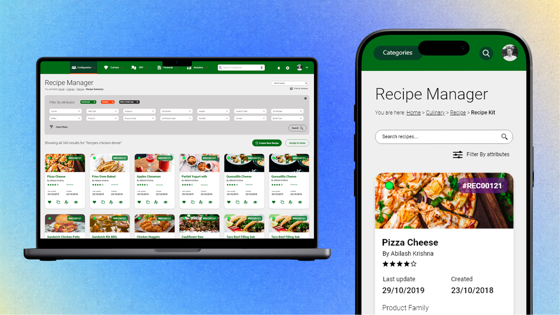
I co-lead a UX UI Design project for a SaaS ERP platform serving 60K+ professionals operating succesfully during 15 years in the United States of America foodservice market.

During 12 intensive weeks the software solution was reimagined to streamline inventory, procurement, and menu planning—unlocking faster workflows across hospitals, universities and schools cafeterias across the USA.

The outdated Foodservice SaaS was slowing down critical operations inside industrial kitchen teams like recipe management and ordering.  

Our full team was composed by VP of Product, Creative Global Director, Engineer Lead, Development team, and our UX/UI Design team of Two members.

With only 12 weeks ahead, We aim to redesign the platform with a modern, mobile-first UX that reduced friction and empowered users to focus on food quality.

From Saturday to Saturday

Real Operations: Food Business Systems

To speed up my Design thinking process, I used a video on Royal Caribbean’s massive culinary operation as an alternative research method to understand large-scale food service systems.

This gave me, as a UX designer, valuable insight into real workflows, team hierarchies, and daily challenges faced by over 500 staff kitchen members—insights that directly inform improvements.

Observing how each role connects with logistics, operations, and sanitation helped bridge the gap between our Foodservice system functionality and actual user needs.

Before we can show you YouTube videos, we must inform you that data may be sent to the provider when you view the videos.

Watch the 1st minute to understand the impact of industrial kitchens in the lifes of many users.

Vision

Think about verbs and actions, not nouns. Industrial kitchens are military-grade operations, an orchestration of people with one single goal in mind: To cook a meal.

We envisioned a system that empowers non-technical industrial kitchen teams with the same control and efficiency as top-tier enterprise platforms —this project aimed to turn complexity into clarity.

There were many layers of improvements but the main goal was to be mobile first, web responsive, and multi-device friendly (Desktop, Tablet, and Mobile).

Aisha Trainee
Junior Sauce
Maria Chef
Eric Hygiene
Kelvin Inventory
Sandro de Italy

Wireframes

Recipe Manager: Advanced search, card display view listing (Card Grid- Card Small List)

Based on our discovery phase we came with ideas to help our users to be more productive and stay away from the screens and in front of the kitchen.

Cards & Main Navigation (Mega menu, Off Canvas, Overlay, Dropdown...?)

We start to play with the idea of cards from Material Design, and explore the different level of information density to provide at each stage of the user journey. Material Design - Expanding (Transition) a Card to full view screen
Menu Recipe Full View XL Card (Desktop)
Recipe Manager with Advanced search
Cards vertical SM (Mobile) vS. Card Horizontal LG (Tablet)
Menu Mega, Off Canvas, Dropdown
As we mapped the platform’s information architecture, our main goal was to reduce friction for users who work under pressure and with little screen time. This meant surfacing relevant actions quickly while minimizing cognitive load.

We broke down the app into five primary modules aligned to real kitchen operations: Menu Planning, Inventory, Orders, Compliance, and Reporting.

"We validated this structure through stakeholder interviews and cross-role walkthroughs."
Each module was structured around specific user roles—such as nutritionists, supply managers, and chefs—ensuring workflows matched their mental models.

For example, a head chef needed rapid access to recipe cards, ingredient availability, and portion adjustments, all within one or two clicks. Meanwhile, the inventory lead required structured dashboards to track low-stock alerts and approve vendor shipments.


These workflows were pressure-tested in early wireframe sessions and later refined through stakeholder feedback and usability heuristics.

The result is a modular system designed to grow with operational needs while remaining intuitive and role-specific.

We explore several routes and designs to showcase a heavy content based software. The menu was organized in 5 main categories (Culinary, ERP, Financial, Analytics, Users) and at least 70 unique software areas to review as Admin User.

Early prototypes followed the corporate purple-heavy palette, but user feedback revealed legibility issues—especially with light font weights and poor contrast on dark backgrounds. We transitioned to a new theme aligned with a green-orange sub-brand, designed for clarity and accessibility.

Design System Foundations: From Recipes to Components

We began with the core metaphor of a recipe—clear, actionable steps to prepare something meaningful. Just like in a kitchen, our interface needed to offer just the right amount of information, at the right moment, to support decision-making. This led us to prioritize card components as a foundational pattern.

"We began with the core metaphor of a recipe."

Color System Evolution: From Purple to Green

The final palette passed WCAG AA contrast checks across all UI elements. For example, the primary button contrast improved from 3.5:1 (purple background, light text) to 4.8:1 (green background, dark text), making the system more inclusive and readable in varied lighting conditions.

Implementation

As we moved toward implementation, I worked closely with the engineering lead and front-end team to ensure a smooth handoff from design to development.

All components were delivered through Figma, with well-documented specs, spacing guides, and behavior annotations tailored for responsive layouts.

We ran weekly design-dev check-ins to validate staging environments, clarify component behavior, and prioritize refinements based on real usage scenarios.

One key win was optimizing touch targets and layout density after observing cafeteria staff use the system on mobile devices with gloves or limited time.

By the time of launch, all key user journeys—from recipe browsing to order summaries—were validated across breakpoints and roles.

This tight feedback loop helped shape a more durable, scalable UI foundation and directly informed version 1.0 of our design system main components.

Design System 1.0 Version (Component Library Overview)

Design System V1.0

Our updated solution for Foodservice Platform now includes a Design system with rules made with and for the real users, our developers team using Kendo React Library and our first custom components.

With Design instructions made in "Developer's language" the goal was to established a bridge between design expectations vs develop tech stack and real life resources and time constraints.